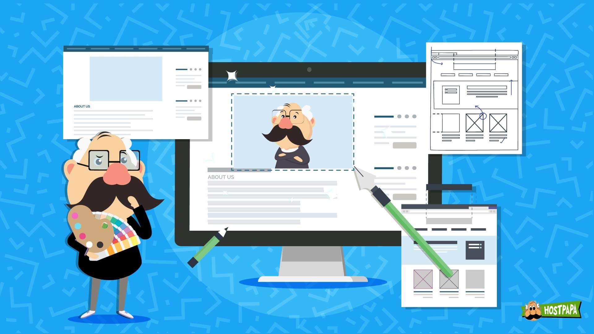
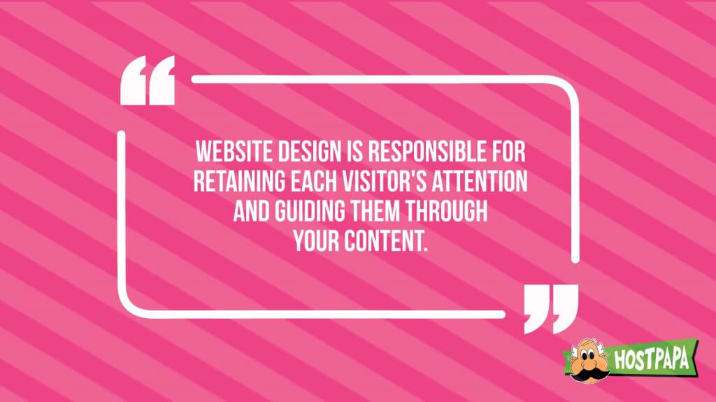
Having an attractive and usable website is the goal of every website owner, and for people who run a small business, the look and feel of their website is of vital importance. It’s where visitors create their first impressions—those brief seconds in which we accept or reject what we see on our screens. A site’s design is also responsible for retaining each visitor’s attention and guiding them through your content.
In this article, we’ll go over seven design principles that, if followed, will help you create a website that engages your visitors and makes them want to come back.
Design is tricky business though. For the less experienced, it’s easy to get carried away and lose focus on what really matters—the experience that visitors have on your site. If you catch yourself geeking out on cool fonts and eye-popping color schemes, you can have some fun. But be sure you also focus on usability and the core purpose of your site.
No matter how interesting your design looks, your site must be simple to read and easy to navigate. Visitors should have no difficulty using your website, and employing a straight-forward design can play a major role in ensuring a high degree of usability.
It’s time to get into our seven design principles. We will discuss layouts that are scientifically proven to match how people consume content, plus talk about spacing, fonts, the effective use of color, and other design factors.
Let’s get started!
Create an Eye-Friendly Layout
A balanced layout that separates the content into easily consumable chunks should be one of your main design goals. Site content like this draws users in, and it’s much more interesting than a wall of text. The best way to achieve this is by imagining an invisible grid or set of columns, and then positioning your content in a balanced and visually appealing way within that framework.
Remember, balanced doesn’t have to mean symmetrical. You can experiment with asymmetrical layouts that lead the viewer’s eyes to where you want them to go.
There’s some interesting science behind how we view webpages. There are studies in which subjects’ eyes are tracked as they consume content, and they have shown that people scan in an “F” pattern.
Simply put, we read from left to right and from top to bottom. Big surprise, right?
Well, when you consider that this rule applies no matter what the content is, you can see how important it is to follow it when designing your site.
If there’s something important that you want visitors to focus on first, whether it’s text or a graphic, the upper left part of your webpage would be the best place to put it. The further to the right and lower your content is, the less attention it will get.
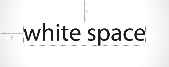
White Space Is Right
Empty space on your web pages opens everything up, allowing visitors to comfortably take in the content you’re presenting. In web design terminology, empty space is called white space, and it’s important to make sure you have enough of it to make your site user-friendly.
White space improves readers’ comprehension. It’s really about what’s near the white space. Any content that’s surrounded by empty space is going to catch the user’s eye, and the content will be easier to absorb because there’s nothing around it to distract the reader.
It may seem obvious, but we should note that your white space doesn’t have to be white—it can be whatever color you choose for your background.
Speaking of color, that’s our next topic!
Employ Color to Engage Visitors
The color scheme you use in your website design should be visually appealing, but, as beauty is in the eye of the beholder, who should it appeal to? There’s one simple answer to that question: your visitors.
Small businesses benefit greatly from a strong brand identity, part of which should be a combination of colors that visually remind people of your company. Those should be the main colors that you use in your web design.
If you haven’t defined your brand colors, that’s a separate project that should get immediate attention. There are many considerations to weigh up, including a detailed analysis of your target audience, color psychology, and other factors.
If you have a main brand color to work with, use it as your starting point in defining your website’s color scheme. All the other colors you include should be chosen based on how well they look with that color.
Brush up on basic color theory and experiment with colors that compliment your main brand color. Select a background color that provides a lot of contrast with text, as this will greatly increase its readability.
When you’ve decided on the right combination of colors, consistently apply the scheme to your website. Your brand’s dominant color can be the main color of your website or serve as an accent color that will draw attention to important page elements.
Use Graphics Wisely
Selecting the right images for your site is a big part of establishing and maintaining your brand. You can rely on text to explain your value proposition, but pictures have the power to create feelings.
If you choose images with your audience in mind, your website graphics can help establish a connection between you and your visitors like no other media can. Consider who your visitors are, then obtain professional photos that will resonate with them. There are many sources for low-priced stock photos on the internet.
Infographics are a great way to include image content on your site, provided that your content is suited to one. If you have complex information to convey, and it can be summarized and will benefit from a chart or graph, then a colorful infographic may be the best format for that.
Your menu icons, button images, and other functional page elements should get serious consideration too. Universally accepted icons like a “home” button image and a shopping cart will help keep your design simple and make your pages easy to navigate.
Letting large images taking over your web pages is not a good idea however. It’s crucial that you consider the concept of a balanced layout when selecting and sizing images for your website.
It’s especially important to avoid using large graphics above-the-fold, that is, in the part of your home page or landing page that visitors see before they start scrolling down the page. In addition to having a negative impact on load time, using large graphics in this part of a page’s layout is a lost opportunity. As communicative as an image can be, that prime page real estate is better used for compelling text that contains your marketing messages.
Any images you use should be optimized to ensure that they don’t contribute to long page load times. In the next section, we’ll explain that in greater detail, along with other web design factors that are geared toward improving site performance.
Minimize Load Time
Don’t let poor design decisions leave you with a slow-loading website. A site that’s too slow will send visitors away in a hurry, and publishing a site in which any page takes more than about three seconds to load is breaking the cardinal rule of website usability.
As mentioned, you must optimize your graphics, determining the ideal size and scale for each image file. If your site has custom code, combine it all in a single CSS or JavaScript file to minimize the number of requests that your web server should make. You can also compress your HTML files to make page loading faster.
Shoot for Maximum Readability
Your website’s fonts will have a massive impact on the readability of the content. If you choose correctly, your marketing messages will jump off the page and visitors will want to read more. If you select poorly, you could end up with an eye-straining mess that’s so hard to read, people will click off your site in seconds.
Which fonts are easiest to read on a computer or mobile screen? There’s been a ton of research into this, and it turns out, it’s sans serif fonts like Arial. The best font size is 16px, with 12px being a hard minimum.
Be consistent with your fonts so that visitors feel there is a cohesive design spanning your content. There’s really no reason to use two different fonts, but you can work with multiple font sizes to best suit a specific piece of content. Don’t use more than two or three font sizes; doing so can throw users off and create a confusing, jumbled appearance that your content should not have.
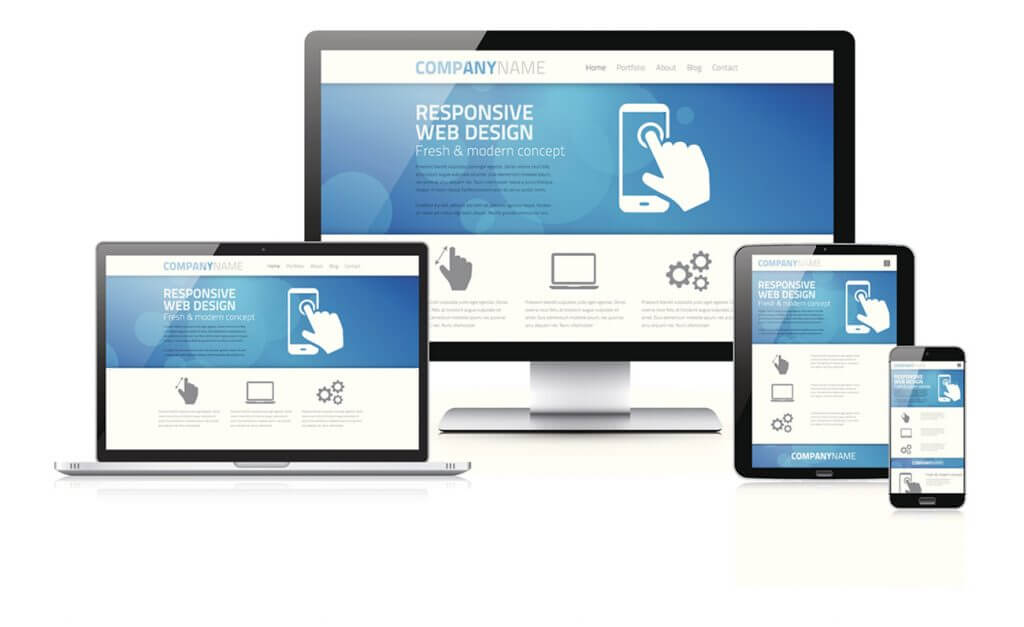
Consider Smaller Screens
People will be accessing your website on screens of all sizes, including on mobile phones and tablets. You need to make sure your design is mobile-friendly.
One of the most important things you can do when designing your site is to aim for responsive design, where there is only one version of your content, but it is displayed differently depending on the size of the screen. With responsive design, mobile visitors can have access to all the great content that you create for display on full-sized screens.
Additionally, you should carefully consider which elements of your content are most valuable to your visitors, and ensure these elements can be located quickly on a mobile device.
Think about mobile users when you choose your fonts and pay attention to how your buttons, icons, and other functional elements will appear on mobile devices. Elements that are easy to click on with a mouse might be frustrating to tap on with a finger on a small screen.
Give Your Website Design the Attention It Deserves
It’s impossible to pay too much attention to your website design. That’s how important it is. When you have a small business, the way your website makes visitors feel and the extent to which it serves their needs will have a huge impact on your success.
In this article, we’ve covered seven of the most important, time-tested web design principles.
If you concentrate on creating an accessible page layout with plenty of white space; use fonts, color and graphics smartly; focus on good performance; and keep mobile users in mind, you’ll be able to come up with a website design that represents your brand effectively and delights users every time they visit.
Are you incorporating these design principles on your website?

